Lyto Jobs Web App
TryHards is Challenge Facilitation Platform that helps game streamers create more engaging interactions with their audience and grow their viewership, so that they can make online streaming into a full time career.
Role: UI/UX Designer
Team: The remote team consisted of 7 people including the CEO, two developers, a lead UI/UX Designer, the Product Manager, and me as a UI/UX Designer. Because this is a bootstrapped startup, most of the team worked on Tryhards part time after their day jobs.
My Responsibilities:
My responsibilities ranged from wireframing, UI mockups, defining personas, user flows, writing copy, creating graphics, and making all final executive decisions on the landing page. As the team was small I collaborated closely with the technical team, product manager, and the lead designer.
The product manager handled most research responsibilities prior to my starting on the project. I worked with the team for general feedback and to understand the company’s needs.
In terms of visual design, the company already had a set UI guide that I was able to contribute to and work within the scope of.
The entire project took two weeks.

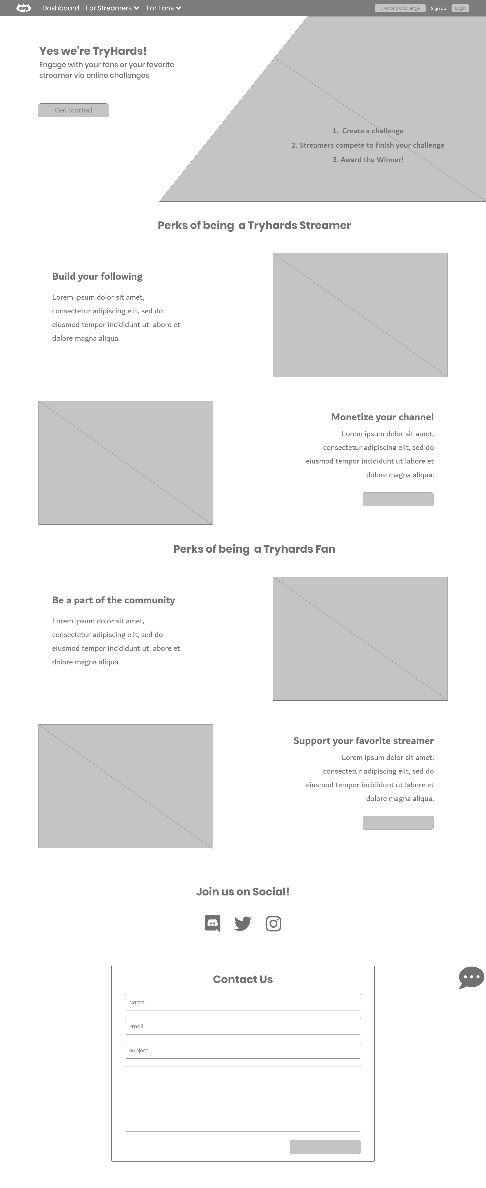
Final Mockup of TryHards’ Landing Page
The problem was that potential users who landed on the platform didn’t understand how to use the platform and how they would benefit from it.
The goal of this project was to build an intuitive landing page that funneled users to sign up and begin using the platform while also better showcasing the platform’s features and selling points.
I adapted to the developer heavy team’s Agile Process.

I began with some simple research and planning by helping the PM narrow down the company’s personas, studying his user journeys, and quickly sketching out a user flow from landing page to other pages. I wanted to see how users could interact with a landing page, where we wanted to lead them, and what important features the landing page needed.
I then created wireframes for different concepts and gathered feedback from the stakeholders. After two iterations of wireframing and gathering feedback, I then consulted the lead UI/UX designer about the company’s UI guide. While I contributed some to the UI guide, I worked mostly within its already established scope for the final hi-fi mockup of the landing page. The last step was working on graphics and finalizing copy. After completing all of that, I sent the designs out for a quick review from the PM and CEO. They trusted my design and so I handed it over to the development team. I trimmed as much fat from the process as I could to get the designs to the developers as quickly as possible.
In true Agile fashion, right after the dev team finished building the landing page I was asked to make a few changes to the design to include a “how to” video that the team was able to put together. I was excited about this because it was an original suggestion I made but we didn’t have anything like that at the time. I made the changes in the hifi mock up and was able to send it over quickly.
Stakeholder Needs
A way to showcase how the platform works
Explain who the platform is for
Explain how the users will benefit from the platform
Lead user to the Sign Up page
The entire project took 2 weeks to complete.

I worked with the Product Manager to narrow down two personas to focus on.
The platform has two main user personas — game streamers and fans of streamers. The team originally had a multitude of personas for each category however, working with the product manager, I was able to narrow it down to two main personas for the company to focus on.

Jon Lamore (Serious Streamer)
Jon Lamore streams 5+ days a week/20+ hours a week, and earns some income through streaming. He has invested money in professional streaming equipment and is selling merch.
Age: 27
Occupation: Software Engineer
Status: Single
Location: Boston, Mass.
Archetype: Gaming Enthusiast
Followers: 100k
Traits: Enthusiastic, Risk Taker, Hardworking
Motivations:
Financial freedom.
Having a community, positive social interactions.
Seeing results of personal achievements.
Fears:
Will be stuck at his soul-crushing job.
Failing to succeed at what he loves doing.
Goals:
To increase his monetization opportunities in order to quit his day job and make streaming his career.
To grow his following and viewership to 1M.
To network with more successful streamers.
Challenges:
Isn’t getting noticed by larger streamers and is having a hard time finding
Saturated market
Doesn’t have experience in marketing or self promotion.

Terri Mason (Active Member)
An active member in the online gaming community: chat, comments, and/or social media. She participates in community events, donates to streamers, and posts messages on live streams. Streamer & community members recognize her name. She is very likely to issue challenges to streamers.
Age: 22
Occupation: Digital Artist
Status: Dating
Location: New York, NY
Archetype: Gamer
Traits: Social Butterfly, Early Adopter
Motivations:
Includes streaming donations in her monthly entertainment budget.
Enjoys convenience.
Likes being first on a new trend.
Goals:
To get noticed by and connect with her favorite streamers.
To make friendships in a community of like-minded people.
Enjoy her time watching streamers.
Challenges:
Is frustrated by the same repetitive content streamers produce.
Has difficulty getting noticed on live stream chats that are overcrowded.
I drew some quick user flows to figure out how our two types of users would interact with the landing page.

The two main constraints I had to work with were not being able to get feedback from the team fast enough and the lack of time for proper usability testing.
Since the launch was quickly approaching, each member of the team was focused on multiple areas of the product simultaneously and so it was difficult to get timely feedback on design requirements. I strongly believed that their feedback was crucial to the project because knowing what the developer can and can’t do within the scope of time they had was important. And understanding the needs of the stakeholders ahead of finalizing designs would prevent any need for redesigns in the near future.
I was able to gather feedback individually from the CEO, PM, and developers individually through Slack. This, however, was a much slower process than if we were able to have a quick video call for any feedback needed. This slower response time wasted a lot of time and I was in a rush to finish by the end.
Unfortunately, the other constraint was not having the time or resources to conduct reliable usability tests on the landing page. I would have loved to conduct interviews with potential users to see how they would interact with the landing page, if it solved their problems and if there were things I could have done better or changed.
My iterations of the Landing Page


The project was a success!
I was able to finish the project on time, meeting all expectations.
Unfortunately, we were unable to conduct any usability testing, so there was no quantitative way to measure success. And since I was only on the team temporarily to help prepare for the launch, I didn’t have access to any analytics that measured bounce rate or audience traffic. I heard from the Product Manager that the launch went well and that they were even able to get a big Twitch streamer to use their platform. To me that sounds like success!
I measured the success of this project by the feedback I received from the team. They were all satisfied and impressed by the work I did and the CEO reached out to me for additional work in the future.

My Take Away
One thing I took away from this project was that the design process is fluid and flexible. The most important thing is being able to adapt a design process that matches the team and can work around the team’s constraints. And as the case is often true in busy startups, being able to hound people down for what you need is an important skill to have.
The landing page is now live! Click here to view it.